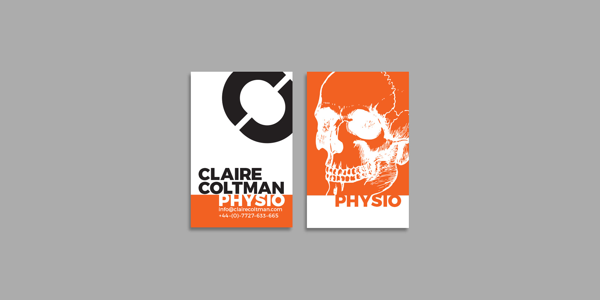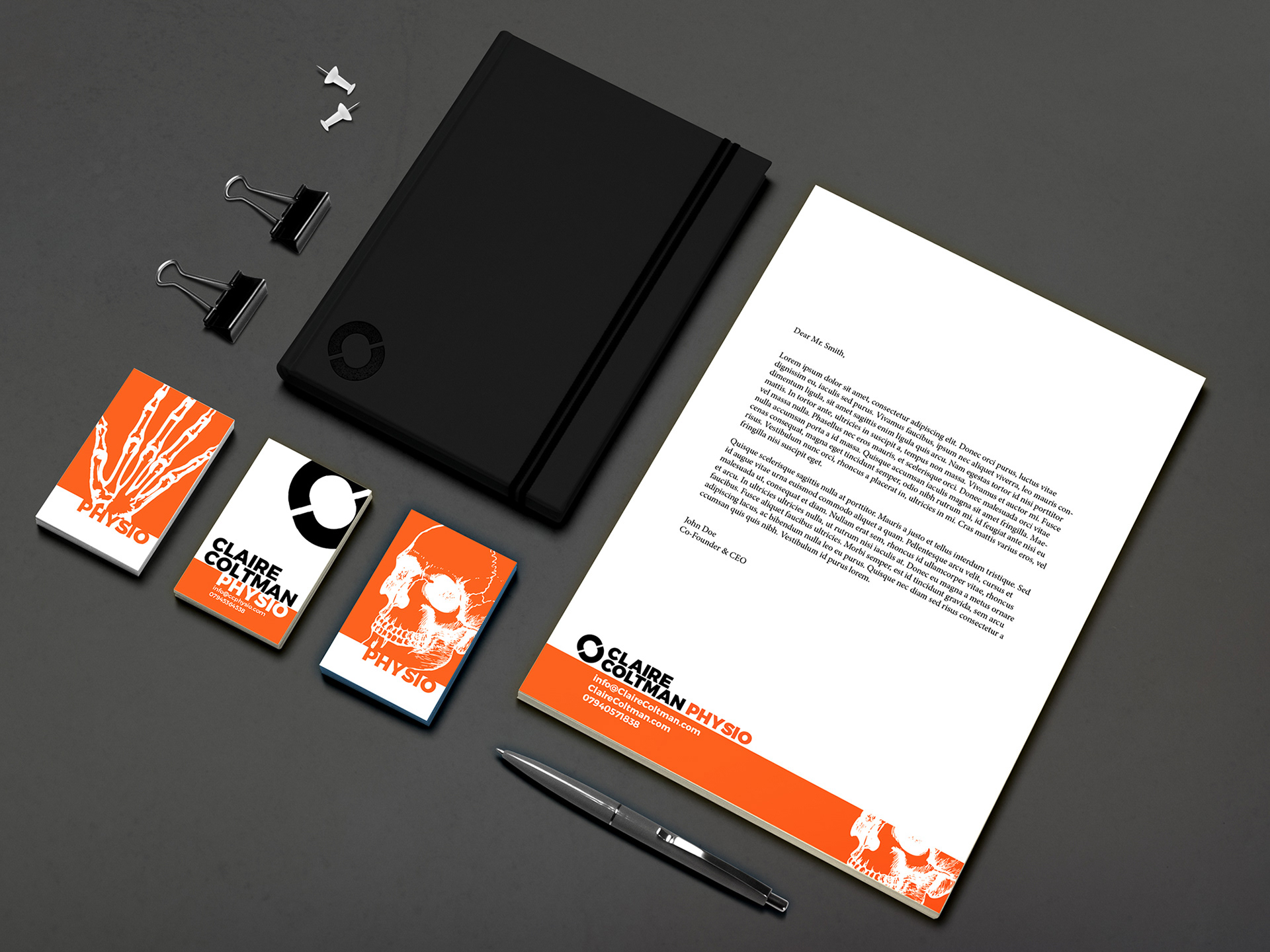
Earlier in the year my wife asked me if I could put together some business cards for her and saw the opportunity to do a little branding for her. For those who don't know, my wife is a specialist physiotherapist dealing with all the weird and wonderful things. In her work life she's down the line, hard working, no nonsense and one of the best in her field. So we needed something strong and eye catching. Thick San Serifs and heavy weights. We needed a colour that would stand out against the sea of blues and greens that normally go along with this kind of work. ORANGE!!
With the layout and other elements I wanted something that would harken back to her winter mountain roots something that wouldn't look too out of place along side the snow sports brands. This is where the fun is, every run of business cards we are going to change up the layout composition and graphical elements much like snowboard decks change up every season and she just gave out her last ones it's time for a new layout.
With the layout and other elements I wanted something that would harken back to her winter mountain roots something that wouldn't look too out of place along side the snow sports brands. This is where the fun is, every run of business cards we are going to change up the layout composition and graphical elements much like snowboard decks change up every season and she just gave out her last ones it's time for a new layout.